The Colours on my Palette
I have become so comfortable with the colours on my palette, the way I lay my colours out, how the colours interact with each other, the brands of oil paints I use… I have experimented so much, tried so many different brands of oil paints, spent so many hours mixing colours in nature…
But it was actually a very short time ago when I was still struggling to know what colours to place on my palette, how to mix the colours I had to achieve the colours I saw before me, and in general how to move intuitively with my paints.

One of the first things we were taught at the Florence Academy of Art was to lay our paints out on our palette in the same order, and in the same position on our palette, each and every time. This is so that it becomes automatic – you don’t have to think, you just instinctively know where to go to find the colour you want.
In addition, we were taught – painstakingly – how to match a colour we saw in life, with a colour we could create on our palettes. Colour matching is now one of the most fun things for me to do, but for a long while I found this intimidating and scary!

I have been painting almost daily for 5 years now. This equates to many “hours under my belt”, many experiments, many struggles and frustrations, and also moments of success and bliss when everything feels like it’s going right.
Throughout this time, I have been learning, little by little and steadily, what works for me and what doesn’t. I have found teachers who have guided me along the way, giving me invaluable information about oil colours, oil paint brands, how to mix, mediums to mix with my paints… With all of this support, I have now become incredibly specific about what works for me and what doesn’t.

I have many tubes of paint in my cabinet in colours that seemed fantastic to try (like Indian Yellow – a transparent yellow similar to Cadmium Yellow) but in practice, I couldn’t get the hang of, or they were too overpowering (like Pthalo green).
The good news is, my practice with the same set of colours has built confidence and ease, and I don’t have to think about what to include, or how a certain colour will react to another.
I have experimented a little bit with the colours on my palette, but not too much. I have stayed aligned to the palette of my Florence Academy of Art teacher Daniela Astone, who first taught me how to paint en plein air landscapes, and to Marc Dalessio, who taught me en plein air painting briefly while I was at the Florence Academy. Daniela and Marc have painted together for years, so their instruction aligned then, and continues to support me today as I return to their paintings and videos for training and inspiration.
How Are My Colours Arranged on my Palette?

I organise my paints from right to left on my handheld New Wave palette. The order of colours stays the same every time – and the placement on my palette also, such that even if a colour is missing on a certain day (which rarely happens), that spot is left open, reserved for just that colour.
One of the early lessons at the Florence Academy of Art was to organise your palette. This consistency in paint colours and placement is essential for speed of painting.
In addition, it’s important to arrange one’s values from dark to light on your palette. I have to admit, in plein air landscape painting, when I’m mixing my colours on my palette, I don’t always arrange my values in order from light to dark. I do try and keep a range of similar colours (such as for the sky, the mountain, the sea) in similar areas on my palette, with the values for that range of colours organised in a row… But it is highly likely someone seeing my palette at the end of a session would not think there was much order in my mixing…

A (surprisingly - even to me!) good example of arranging my mixed colours by value - darker to lighter

A messier palette…
So What Are My Colours?
My colours, from right to left:
Titanium White
Cadmium Yellow Light (cooler, bluer hue)
Cadmium Yellow Medium (warmer, redder hue)
Yellow Ochre
Cadmium Orange
Cadmium Red
Transparent Red Oxide
Alizarin Crimson
King’s Blue Deep
Cerulean Blue
Cobalt Blue
Ultramarine Blue
Twelve different oil colours. When I write it down, it seems like quite a lot! But each colour is essential for me to be comfortable and confident when I’m outside tackling the myriad of exciting colours before me.
What About Grey?
Grey is an invaluable colour to “dull down” a high chroma colour, and also is essential for atmospheric effect (the impression of something receding in space – critical for a sense of depth, and the primary goal of a landscape painting).
In an effort not to waste high-quality paint, at the end of a painting session, I mix together the left-over paint on my palette to form a grey – it can be a warm grey or a cool grey – it doesn’t matter. I can always adjust it depending on what I need when I use it. But I find having a grey on my palette very useful, and I love making my own, rather than buying a pre-mixed grey. It gives my colours more vibrancy and variety, I feel.
In addition, I often “scrape clean” my palette during a painting session, mixing the colours mixed so far into a grey, or adding the mix to my existing grey. And then I wipe my palette clean with paper towel and literally, start again. This is particularly helpful when I’ve just finished painting one section of the painting – like the sky, or the sea, or the foliage – and now I’m about to move onto another section with a different range of similar colours.
Brand of Oil Paints
This is a very personal choice, and one – for me – that was influenced strongly by my training at the Florence Academy of Art. We were exposed to the highest quality oil paints (primarily from Zecchi or Rigacci art stores in Florence), and we were shown the difference between using high quality (read: high pigment) oil paints, and student grade oil paints (often “waxier”, with “fillers” that build out volume but dilute chroma, meaning you need a lot more paint to achieve a similar intensity of colour).

Some of the professional quality oil paint brands I use
I now know from experience the value in investing in a more expensive tube of oil paint, because while costly now, I know it will last for many, many years, as I won’t need very much of it to achieve the desired colour. I usually buy Michael Harding, Williamsburg, Old Holland, Utrecht, Blue Ridge or Zecchi’s. I have had a tube of Utrecht Cadmium Orange for 25 years – my grandmother gifted it to me!

The Utrecht Cadmium Orange I’ve had since my teens, gifted to me by my grandmother (also an artist)
Using Limited Palettes
My palette of 12 colours is what I’m used to and what I like, but I do have ambitions to try more limited palettes on some days. A plein air painter friend Beth Lowe says she will try experiment with something new every time she goes out to paint, including limiting her colours or trying colours she’s never experimented with before.
One day, I removed Ultramarine Blue from my palette. That was a mistake – I think some colours truly are essential! But while in Sicily, I shared my friend Denise Melvin’s paints, and had a palette of fewer blues and fewer yellows, and I found I was just as able to create the colours I wanted.
When I see a shiny new colour (there are many!) at the art shop and I buy it, often it just gathers dust in my studio cupboard. Except for King’s Blue Deep – that was an impulse buy and I have discovered I love this colour. It is perfect for the lower parts of the sky! I mentioned Indian Yellow before. While it has been lauded by other artists whose work I admire, it has frustrated me, and makes my colours feel “dirty”. As it is a transparent colour, I’ve tried it to make dark greens in shadow (it’s ideal to keep shadows thin and transparent), and it does work well for this, but having Indian Yellow on my palette is confusing as I end up using it more than I’d like…
Tip: Another lesson from Daniela Astone and many other teachers at FAA – don’t put any colour on your palette unless it belongs there, because you will end up using it!
My perseverance – and at times, stubbornness – to keep getting out there, to keep trying, day after day, even when sometimes I feel like I’m throwing down the paint and just making a mess, has all been teaching me. And now that I feel so confident and comfortable with my palette, I can focus my energy on the myriad other elements that challenge me as a painter.

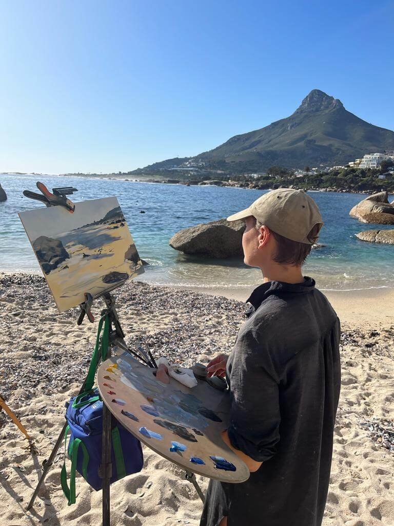
Painting on the rocks of Bakoven Beach